Back
Client
Industry
Engagement
Bright: Illuminating Education through Cultural Connection.
Bright: Illuminating Education through Cultural Connection.

Back
Client
Industry
Engagement
Bright needed a unique, student-centric brand that embodied fun and engagement, aligning with their mission to make quality education accessible and enjoyable.
The primary audience includes 10th-grade students, with plans to expand to 11th and 12th graders. Secondary audiences include teachers, parents, and Vietnamese educational institutions.

We researched gamification to boost motivation and engagement, studied successful online learning platforms, and immersed ourselves in Vietnamese culture to ensure cultural resonance and relevance.
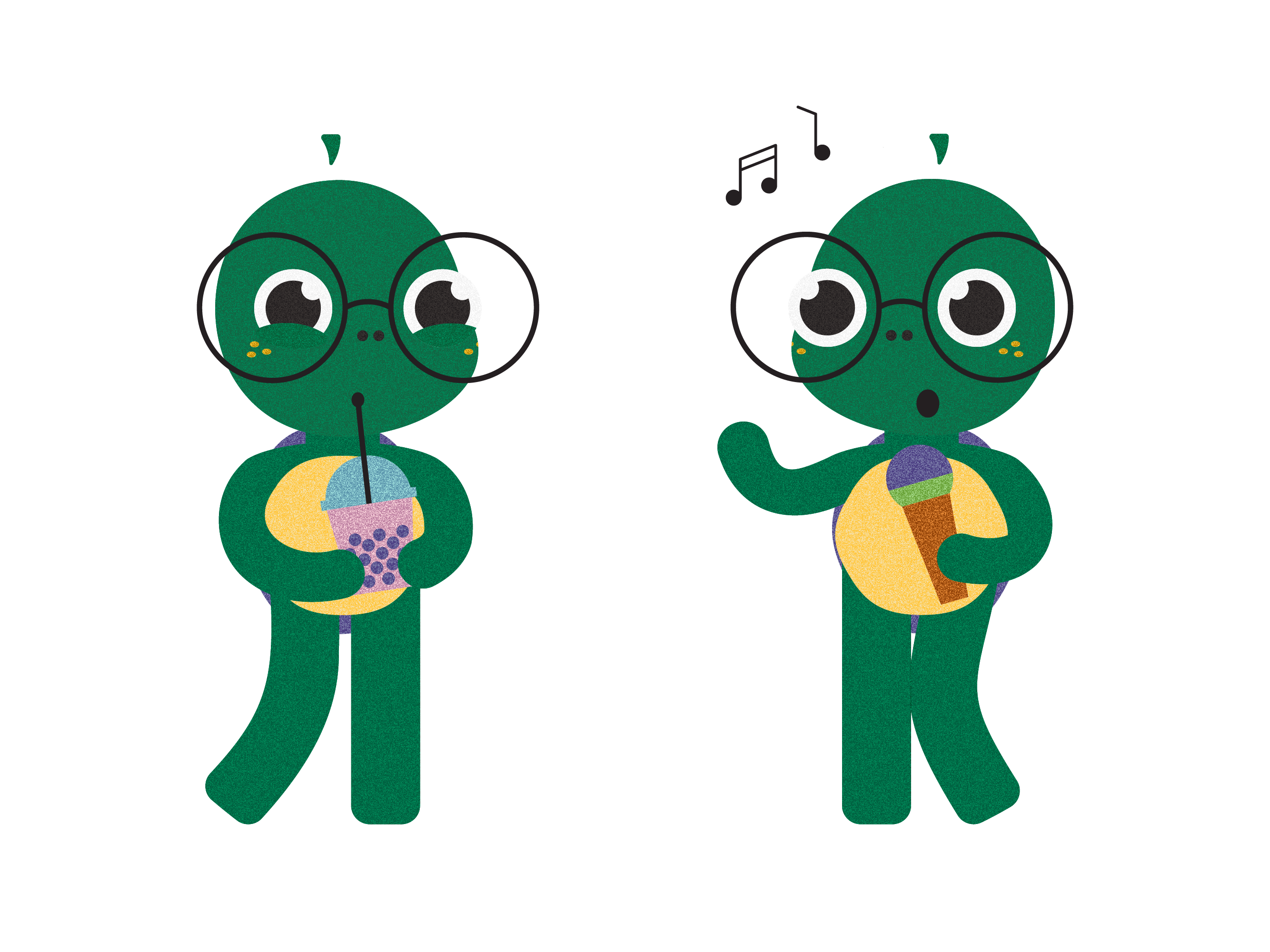
We focused on integrating Vietnamese cultural symbols, like the tortoise, into the brand identity. This involved creating a relatable brand mascot and using bold, bright colors paired with grain textures to make the brand memorable. We developed various facial expressions for the mascot to enhance communication and engagement.


The logo concept for Bright is deeply rooted in Vietnamese cultural symbolism, particularly the significance of the tortoise. In Vietnamese culture, the tortoise is one of the four sacred animals and represents longevity, education, and wisdom. A well-known symbol of this is the giant marble tortoise at Thien Mu Pagoda in Hue City, which students traditionally touch for good luck before exams. By incorporating this culturally significant symbol into the logo, Bright ensures immediate resonance and relatability with its target audience, helping to build trust and credibility from the outset.
The key challenge was ensuring the tortoise mascot was both distinguishable and appealing to high school students without appearing childish. To achieve this, the mascot was designed with longer legs, a shorter torso, big eyes, and glasses, balancing cuteness with age-appropriateness. This made the character relatable to the target market.


The brand essence is the core value that guides all business and design decisions. For Bright, the brand essence is to provide educational resources to help students thrive. This essence was simplified into the slogan:
"Helping students grow."
This slogan was crafted to be easily translated into Vietnamese and understood in both languages.

To ensure consistency and clarity across all touchpoints, we developed comprehensive brand guidelines for Bright. These guidelines cover various aspects of the brand's visual and verbal identity, ensuring that all communications and materials align with the brand's core values and mission.

The final design featured a culturally relevant tortoise mascot, bold colors, and playful illustrations that resonate with Vietnamese students. The brand essence, "Helping students grow," was simplified into a bilingual slogan to ensure broad understanding.


At Mäd, we believe in creating meaningful work that builds impactful relationships. Collaborating with Bright aligned with our mission of promoting accessible education. This project demonstrates the power of culturally resonant design and strategic branding in enhancing educational experiences. Is your brand future-proof?
Work with our expert team to transform your business and exceed objectives.
Together we can Make It Happen.™


